You don't need a hundred components to get the benefits of a design system. Here's the lightweight version we set up on most projects.
“Design system” can sound like something only big companies need. In practice, even a team of three benefits from a shared set of decisions, as long as it stays small and stays in use.
What we mean by a design system
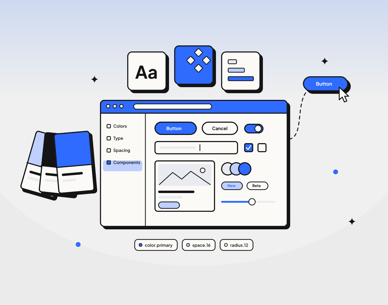
For most of our projects, a design system is three things:
- Tokens: colors, type sizes, spacing and corner radius, each with a name
- Components: the twenty or so pieces every screen is built from, like buttons, inputs, cards and modals
- Rules: short notes on when to use what, written where people will see them
That’s it. No hundred-page document, no separate website.
Start from real screens
We don’t design components in a vacuum. We design the first few real screens, then pull out the parts that repeat. A button becomes a component the second time it appears, not before.
This keeps the system honest. Every component exists because a real screen needed it.
Name things the way the team talks
If the team calls it a “chip”, the component is called Chip, even if another system calls it a tag or a pill. Matching the words people already use is the quickest way to make sure the system actually gets used.
Design and code use the same names
The Figma component and the code component share a name and the same options. When a designer says “use the secondary button, small size”, an engineer knows exactly what to build, and nothing gets lost between the mockup and the code.
Keep it alive
A design system that isn’t updated becomes a museum. We keep ours in the same place as the product work, review changes in the same meetings, and remove components nobody uses.
Small, named, shared and maintained. That’s enough to make a team noticeably faster.
Working on something similar?
Tell us what you're building. We'll come back with questions and a plan.
Start a project